Understand the network heatmap data
This short video is intended to provide a brief introduction to the Network Capacity Heatmaps in the ConnectMore tool. The tool covers Merseyside, Cheshire, North Shropshire, North & Mid Wales – the MANWEB license area covered by SP Energy Networks.
ConnectMore provides modelled information on available capacity to connect to assets on the Low Voltage and High Voltage network on separate heatmap layers. The LV heatmap covers connection capacity up to 150kilovolt Ampere or kVA, while the HV heatmap covers assts from 250 to 2500kVA.
Modelled capacity is based on the assets loading or demand compared to its rating or maximum capacity. The modelled approach used in ConnectMore is the same methodology used by SPEN's connection engineers when they assess a connection request.
First, click on the orange ‘Next’ button to select the Electricity network capacity heatmaps. I’m now going to choose the LV Network Capacity Heatmap.
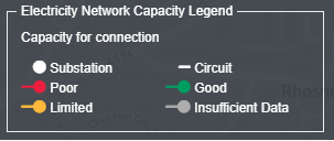
The Red, Amber or Green status of assets are based on their modelled capacity. This colour coding is provided to give a visual indication of the available capacity of each asset.
The Electricity Network Capacity legend is always visible at the top of the sidebar when the heatmap is selected. If analysis indicates there is capacity available for a connection, assets are shown in green as opposed to amber and red, which indicates limited or no spare capacity is currently available without reinforcement. A very small number of assets are also shown in grey, indicating network data is not accessible. The number of grey assets will reduce as more data is made available.

You can access data for a specific asset by clicking on it.
(Click on a transformer)
For a transformer, - the circle symbols on the map - the tool will display in the right-hand panel, the substation ID, the transformer’s rating, and an indicative assessment of its available capacity. (Circle or zoom in on this information)
(Click on a conductor segment)
For each segment of a line or a cable, similar data is also available. It is worth mentioning that cables or overhead lines are only shown on the map when it is zoomed in to level 16 or higher
To get an indication of available network capacities, you can test different connection sizes
The connection rating of an asset is calculated based on its modelled capacity and the size of the connection being assessed. The colour of the asset on the map may change and the asset capacity rating in the asset data information could alter too, depending on whether the network would be able to accommodate the connection size requested.
This feature may be of particular interest to you if you can be flexible about your connection size or location you are researching.
It could be that, for example, a 100kVA connection at a specific location would require network reinforcement but a slightly smaller 75kVA connection would show capacity is available on the network in a desired location.
You can toggle to the HV Network Capacity heatmap using select the tick box at the top of the menu. This feature allows you to toggle between the two heatmaps although you cannot display both sets of data at the same time.
The HV network capacity heat map should be used to research potential capacity connection between 250kVA and 2500kVA. Assets data is displayed in the same way. Here you can see the HV transformers and cables around rural Cheshire and, as the slider is moved to from 250kVA up to 2500kVA, how the colour of the assets change, indicating the extent of available capacity.